
GeoPandas Tutorial: How to plot US Maps in Python
In this tutorial we will take a look at the powerful geopandas library and use it to plot a map of the United States. You can run all of the python code examples in the tutorial by cloning the companion github repository.
I have used other GIS libraries in python and let me say geopandas is a real joy to use!
Jonathan Cutrer
A quick note before we start
I assume you know some basic python and how to install jupyter to run the companion notebook. To start, clone my git repository with the following commands.
git clone https://github.com/joncutrer/geopandas-tutorial.git
cd geopandas-tutorial
jupyter notebook
Here are the commands you will need to run if have not already installed geopandas.
conda install geopandas
conda install -c conda-forge descartes
Geo Data Files
The data we will be working with comes from the US Census and is in a common shapefile format. A shapefile actually consists of 3 separate files with the same file name.
- filename.shp – Shapefile shape format, contains the actual geometry data.
- filename.dbf – Shapefile attribute format, this file stores the attributes for each shape. it uses the dBase IV format.
- filename.shx – Shapefile index, this file makes working with larger shapefiles faster. It contains no unique data, only an index of record offsets.
The shapefile format is a geospatial vector data format for geographic information system (GIS) software. It is developed and regulated by Esri as a mostly open specification for data interoperability among Esri and other GIS software products.
Wikipedia
ls -al datatotal 364 drwxrwxr-x 2 sysadmin sysadmin 4096 May 1 20:37 ./ drwxrwxr-x 4 sysadmin sysadmin 4096 May 2 03:20 ../ -rw-rw-r-- 1 sysadmin sysadmin 5 May 1 20:37 usa-states-census-2014.cpg -rw-rw-r-- 1 sysadmin sysadmin 15201 May 1 20:37 usa-states-census-2014.dbf -rw-rw-r-- 1 sysadmin sysadmin 143 May 1 20:37 usa-states-census-2014.prj -rw-rw-r-- 1 sysadmin sysadmin 257 May 1 20:37 usa-states-census-2014.qpj -rw-rw-r-- 1 sysadmin sysadmin 309672 May 1 20:37 usa-states-census-2014.shp -rw-rw-r-- 1 sysadmin sysadmin 18517 May 1 20:37 usa-states-census-2014.shp.xml -rw-rw-r-- 1 sysadmin sysadmin 564 May 1 20:37 usa-states-census-2014.shx
Reading shapefiles
Import the geopandas library and matplotlib for later use.
import matplotlib.pyplot as plt
import geopandas
Use the geopandas.read_file() function to read the shapefile from disk. Geopandas will return a GeoDataFrame object which is similar to a pandas DataFrame.
states = geopandas.read_file('data/usa-states-census-2014.shp')
type(states)
geopandas.geodataframe.GeoDataFrame
states.head()| STATEFP | STATENS | AFFGEOID | GEOID | STUSPS | NAME | LSAD | ALAND | AWATER | region | geometry | |
|---|---|---|---|---|---|---|---|---|---|---|---|
| 0 | 06 | 01779778 | 0400000US06 | 06 | CA | California | 00 | 403483823181 | 20483271881 | West | MULTIPOLYGON Z (((-118.59397 33.46720 0.00000,… |
| 1 | 11 | 01702382 | 0400000US11 | 11 | DC | District of Columbia | 00 | 158350578 | 18633500 | Northeast | POLYGON Z ((-77.11976 38.93434 0.00000, -77.04… |
| 2 | 12 | 00294478 | 0400000US12 | 12 | FL | Florida | 00 | 138903200855 | 31407883551 | Southeast | MULTIPOLYGON Z (((-81.81169 24.56874 0.00000, … |
| 3 | 13 | 01705317 | 0400000US13 | 13 | GA | Georgia | 00 | 148963503399 | 4947080103 | Southeast | POLYGON Z ((-85.60516 34.98468 0.00000, -85.47… |
| 4 | 16 | 01779783 | 0400000US16 | 16 | ID | Idaho | 00 | 214045425549 | 2397728105 | West | POLYGON Z ((-117.24303 44.39097 0.00000, -117…. |
Understanding Coordinate reference systems (CRS)
By default this shapefile contains very commons coordinates called WGS 84. While WGS 84 is very common in GIS mapping, Mercator projection is the de facto standard for Web mapping applications. If you want to learn more about coordinate systems, have a look at this excellent post EPSG 4326 vs EPSG 3857 by Lyzi Diamond.
states.crsName: WGS 84 Axis Info [ellipsoidal]: - Lat[north]: Geodetic latitude (degree) - Lon[east]: Geodetic longitude (degree) Area of Use: - name: World - bounds: (-180.0, -90.0, 180.0, 90.0) Datum: World Geodetic System 1984 - Ellipsoid: WGS 84 - Prime Meridian: Greenwich
Geopandas requires we know the geospatial reference system identifier so here is a list of common ones.
- “EPSG:4326” WGS84 Latitude/Longitude, used in GPS
- “EPSG:3395” Spherical Mercator. Google Maps, OpenStreetMap, Bing Maps
- “EPSG:32633” UTM Zones (North) – (Universal Transverse Mercator)
- “EPSG:32733” UTM Zones (South) – (Universal Transverse Mercator)
To make the map look a little more familiar lets reproject it’s coordinates to Mercator.
states = states.to_crs("EPSG:3395")Plotting Shapefiles
Now lets plot our GeoDataFrame and see what we get. Just like pandas, geopandas provides a .plot() method on GeoDataFrames.
states.plot()
We can also plot the state polygons with no fill color by using GeoDataFrame.boundary.plot().
states.boundary.plot()
Add some color to the map plot
Our map is bit small and only one solid color. Lets enlarge it and add a colormap
Here are some cmap codes you can play around with.
viridis, plasma, inferno, magma, cividis
Greys, Purples, Blues, Greens, Oranges, Reds
YlOrBr, OrRd, PuRd, RdPu, BuPu, GnBu, PuBu, YlGnBu, PuBuGn, BuGn, YlGn
PiYg, PRGn, BrBG, PuOr, RdGy, RdBu, RdYlBu, Spectral, coolwarm, bwr, seismic
twilight, twilight_shifted, hsv
Pastel1, Pastel2, PAired, Accent, Dark2, Set1, Set2, Set3, tab10, tab20, tab20b, tab20c
More info on colormaps can be found here https://matplotlib.org/tutorials/colors/colormaps.html
states.plot(cmap='magma', figsize=(12, 12))
Query the DataFrame for a specific state shape, I will plot Texas.
states[states['NAME'] == 'Texas']
| STATEFP | STATENS | AFFGEOID | GEOID | STUSPS | NAME | LSAD | ALAND | AWATER | region | geometry | |
|---|---|---|---|---|---|---|---|---|---|---|---|
| 16 | 48 | 01779801 | 0400000US48 | 48 | TX | Texas | 00 | 676601887070 | 19059877230 | Southwest | POLYGON Z ((-11869267.604 3729445.479 0.000, -… |
states[states['NAME'] == 'Texas'].plot(figsize=(12, 12))

Plotting multiple shapes
Plot multiple states together, here are the states that makeup the South East region of the United States.
southeast = states[states['STUSPS'].isin(['FL','GA','AL','SC','NC', 'TN', 'AR', 'LA', 'MS'])]
southeast
| STATEFP | STATENS | AFFGEOID | GEOID | STUSPS | NAME | LSAD | ALAND | AWATER | region | geometry | |
|---|---|---|---|---|---|---|---|---|---|---|---|
| 2 | 12 | 00294478 | 0400000US12 | 12 | FL | Florida | 00 | 138903200855 | 31407883551 | Southeast | MULTIPOLYGON Z (((-9107236.006 2805107.013 0.0… |
| 3 | 13 | 01705317 | 0400000US13 | 13 | GA | Georgia | 00 | 148963503399 | 4947080103 | Southeast | POLYGON Z ((-9529523.377 4137300.133 0.000, -9… |
| 8 | 22 | 01629543 | 0400000US22 | 22 | LA | Louisiana | 00 | 111901043977 | 23750204105 | Southeast | POLYGON Z ((-10468824.609 3831551.686 0.000, -… |
| 15 | 47 | 01325873 | 0400000US47 | 47 | TN | Tennessee | 00 | 106800130794 | 2352882756 | Southeast | POLYGON Z ((-10052227.608 4143268.692 0.000, -… |
| 20 | 05 | 00068085 | 0400000US05 | 05 | AR | Arkansas | 00 | 134771603434 | 2960200961 | Southeast | POLYGON Z ((-10532818.563 4344142.083 0.000, -… |
| 26 | 37 | 01027616 | 0400000US37 | 37 | NC | North Carolina | 00 | 125917995955 | 13472722504 | Southeast | POLYGON Z ((-9382741.386 4167242.730 0.000, -9… |
| 30 | 28 | 01779790 | 0400000US28 | 28 | MS | Mississippi | 00 | 121531899917 | 3928587545 | Southeast | POLYGON Z ((-10199242.918 3645403.465 0.000, -… |
| 33 | 45 | 01779799 | 0400000US45 | 45 | SC | South Carolina | 00 | 77857913931 | 5074749305 | Southeast | POLYGON Z ((-9278840.010 4102724.263 0.000, -9… |
| 41 | 01 | 01779775 | 0400000US01 | 01 | AL | Alabama | 00 | 131172403111 | 4594951242 | Southeast | POLYGON Z ((-9848286.459 3726812.322 0.000, -9… |
southeast.plot(cmap='tab10', figsize=(14, 12))

Instead of supplying a list of states you may have noticed there is a region column in our GeoDataFrame. Lets query by region and plot the West Region.
west = states[states['region'] == 'West']
west.plot(cmap='Pastel2', figsize=(12, 12))

Add outlines and labels to each State
Here is another plot of the U.S NorthEast but this time we are going to use a lambda function to plot the state name over each state. We also plotting the state shapes with a black outline.
As a bonus code snippet, I have added a vertical watermark to the left side of the image.
fig = plt.figure(1, figsize=(25,15))
ax = fig.add_subplot()
west.apply(lambda x: ax.annotate(s=x.NAME, xy=x.geometry.centroid.coords[0], ha='center', fontsize=14),axis=1);
west.boundary.plot(ax=ax, color='Black', linewidth=.4)
west.plot(ax=ax, cmap='Pastel2', figsize=(12, 12))
ax.text(-0.05, 0.5, 'https://jcutrer.com', transform=ax.transAxes,
        fontsize=20, color='gray', alpha=0.5,
        ha='center', va='center', rotation='90')

Multiline Labels
Building on the above example, we can also use a newline (\n) character to create multiline labels. This is useful if you want to display some other data column from the GeoDataFrame. Here I am plotting the state name as well as the land area of the state in square miles.
import math
fig = plt.figure(1, figsize=(25,15))
ax = fig.add_subplot()
west.apply(lambda x: ax.annotate(
    s=x.NAME + "\n" + str(math.floor(x.ALAND / 2589988.1103)) + " sq mi",
    xy=x.geometry.centroid.coords[0],
    ha='center',
    fontsize=14
),axis=1);
west.boundary.plot(ax=ax, color='Black', linewidth=.4)
west.plot(ax=ax, cmap='Pastel2', figsize=(12, 12))

Multiline Labels using a longitudinal offset
If we want to change the font size of our second data row or place the label somewhere other than directly below we will need to use a lat,long offset to draw a second label in another call to annotate()
To understand how we do this, lets first look at the data in x.geometry.centroid.coords[0]
The annotate() method requires we provide a tuple for attribute xy. In the previous apply lambda function we are passing x.geometry.centroid.coords[0].
# Get the first state
tmpdf = states.iloc[0]
# Which state
print(tmpdf.NAME)
# Get the centroid coordinates
tmpdf.geometry.centroid.coords[0]
California
(-13322855.654888818, 4465905.292663821)
This is the xy coordinates of the first state. This is where our label is plotted. We can pass an offset to xy like this.
( tmpdf.geometry.centroid.coords[0][0], tmpdf.geometry.centroid.coords[0][1] - 55000 )
(-13322855.654888818, 4410905.292663821)
Here is the complete example where we print 3 labels. State name, land area, and FIPS code. I will also use a different font size and color for the second two labels.
import math
fig = plt.figure(1, figsize=(25,15))
ax = fig.add_subplot()
# Label 1 State Name
west.apply(lambda x: ax.annotate(s=x.NAME, xy=x.geometry.centroid.coords[0], ha='center', fontsize=14),axis=1);
# Label 2 Area using longitudinal offset
west.apply(
    lambda x: ax.annotate(
        s="Area(Sq/Mi): " + str(math.floor(x.ALAND / 2589988.1103)),
        xy= (x.geometry.centroid.coords[0][0], x.geometry.centroid.coords[0][1] - 55000 ),
        ha='center',
        color='#000077', # blue
        fontsize=10),axis=1);
# Label 3 FIPS Code using longitudinal Offset
west.apply(
    lambda x: ax.annotate(
        s="FIPS Code: " + x.STATEFP,
        xy= (x.geometry.centroid.coords[0][0] , x.geometry.centroid.coords[0][1] + 60000 ),
        ha='center',
        color='#770000', #red
        fontsize=10),axis=1);
west.boundary.plot(ax=ax, color='Black', linewidth=.4)
west.plot(ax=ax, cmap='Pastel2', figsize=(12, 12))

Combining Overlay Maps
Here is an example where we create a larger boundary map and then overlay in a second map. It’s important to note that figsize must be specified in the first plot.
us_boundary_map = states.boundary.plot(figsize=(18, 12), color="Gray")
west.plot(ax=us_boundary_map,  color="DarkGray")
We can continue to chain our plots together to a plot of all othe United States Regions.
The first plot us_boundary_map serves as our base map.
Then we reference it with ax=us_boundary_map when we call plot() on each of our region GeoDataFrame.
west = states[states['region'] == 'West']
southwest = states[states['region'] == 'Southwest']
southeast = states[states['region'] == 'Southeast']
midwest = states[states['region'] == 'Midwest']
northeast = states[states['region'] == 'Northeast']
us_boundary_map = states.boundary.plot(figsize=(18, 12), color='Black', linewidth=.5)
west.plot(ax=us_boundary_map,  color="MistyRose")
southwest.plot(ax=us_boundary_map, color="PaleGoldenRod")
southeast.plot(ax=us_boundary_map, color="Plum")
midwest.plot(ax=us_boundary_map, color="PaleTurquoise")
final_map = northeast.plot(ax=us_boundary_map, color="LightPink")

Tuning map attributes based on plot size
If you intend to plot a small map the default linewidth of 1 is probably too large. You can use decimal numbers to plot smaller lines.
tiny_map = states.boundary.plot(figsize=(5, 5), color="Black")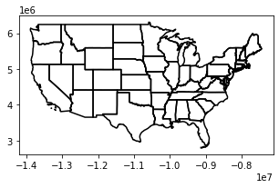
tiny_map = states.boundary.plot(figsize=(5, 5), color="Black", linewidth=.25)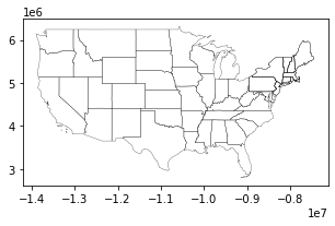
If you intend to generate a large map you should consider increasing the linewidth.
hires_map = states.boundary.plot(figsize=(50, 28), color="Gray", linewidth=4)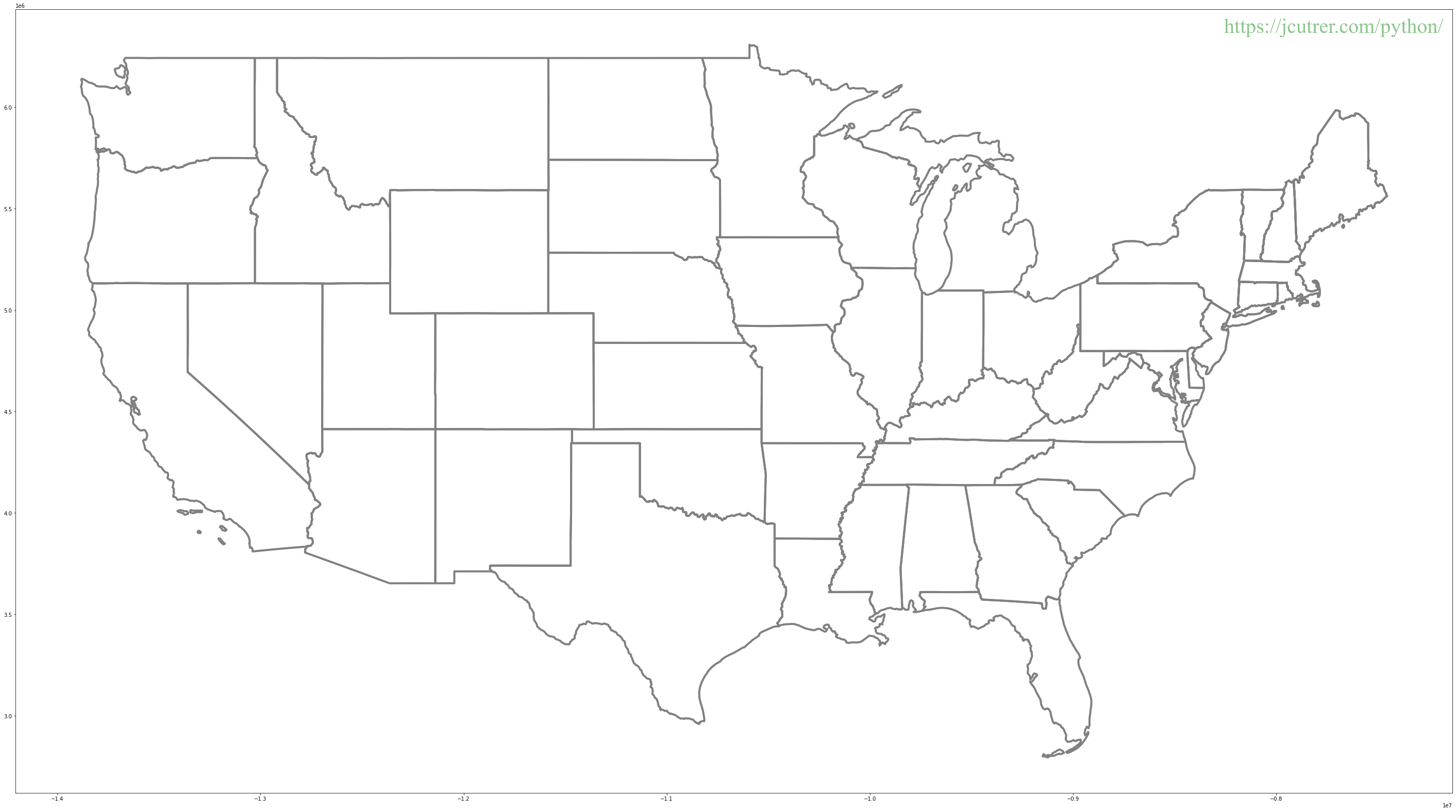
us_map = states.boundary.plot(figsize=(25, 14),  color="#555555", linewidth=1)
us_map.axis('off')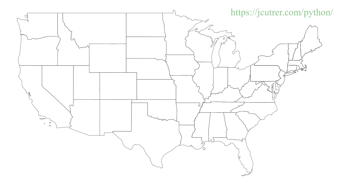
Saving the map plot to disk
What if we want to save our map? We need to get the figure, trim whitespace and call savefig()
fig = us_map.get_figure()
fig.tight_layout()
fig.savefig('usa.png', dpi=96)
ls -al usa.png
-rw-rw-r-- 1 sysadmin sysadmin 236624 May 2 03:22 usa.png
from IPython.display import Image
Image(filename='usa.png') 
Congratulations, you are well on your way to becoming a GIS expert with geopandas. I hope this tutorial has helped you learn a little more about GeoPandas.
If this GeoPandas tutorial inspires you to create something awesome, please come back here and share it with the rest of us in the comments section below.
If you enjoyed this article you might also like Learn geopandas by plotting tornados on a map
References
- joncutrer/geopandas-tutorial companion github repo
- GeoPandas Documentation
- Shapefile Wikipedia Page
- EPSG 4326 vs EPSG 3857 by Lyzi Diamond
- Choosing Colormaps in Matplotlib
You can also download an offline version of this article here

14 Replies to “GeoPandas Tutorial: How to plot US Maps in Python”
nice article
thank you, I appreciate the feedback!
I have one query. I want to annoate additional information for each State under its label.
I see in your example you have:
west.apply(lambda x: ax.annotate(s=x.NAME, xy=x.geometry.centroid.coords[0], ha=’center’, fontsize=14),axis=1);
If I want to add some label with additional info below the actual State name like weather degress how can I offset it like 5pixel below the centroid ? do I have to use geojson and bokey ?
Thanks for the great question!
You can accomplish this in two ways.
1. Use a newline \n
2. Plot a second label passing an offset to xy.
Additional examples have been added to the article above as well as the Jupyter notebook in the github repo.
Using newline works but the second option I am unable to make it work. I want to use it so that I can show mix and max temperature in two different colors etc. If I just use \n + temperature its ignoring \n using second option.
Excellent Tutorial!!! Is there documentation for doing the same thing with all US counties?
You just need to download the county shapefiles from US census.
https://www.census.gov/geographies/mapping-files/time-series/geo/carto-boundary-file.html
Thanks for making this tutorial, very helpful. Hope you can make more.
Thanks for the running start. Do you have any pointers to overlaying a grid on the map?
thanks for the tutorial it’s great! If I would like to plot each state in individually how would i go about that?
Thanks a lot for the tutorials. It is great.
Very good. I enjoyed your presentation.
Hi,
Thank you for the tutorial – it’s great.
I had a question about the annotations, if you annotate the entire US map with the states names (or anything else) then some will be way off center or squished.
Is there any method of rectifying this easily, or would I need to create a separate annotation for each one, such as to place them in a more aesthetically pleasing manner?
Here is what I mean:
https://i.imgur.com/h9pw04o.png
Thanks for this magnificent article! It really helped me in my social survey project!